Overcoming the Fear of the Blank Canvas: How I Start a Design Project
For a lot of people, the blank canvas is fear-inducing. All that white is blinding. Where do I start? The possibilities seem endless.
There’s a misconception that you have to have everything figured out before you start. I guess it makes sense; people usually like to know where they’re going before they leave. But, with most creative work, I’ve found that clarity comes in doing.
So, how do you do it?
My Solution: I Avoid The Blank Canvas At All Costs
Instead of staring at a blank screen, I start pulling together all the pieces I need.
Interestingly enough, cooking has a similar term: Mis en Place. It means “putting in place” or “everything in its place.” It refers to all the necessary prep work before cooking: organizing and arranging ingredients, chopping vegetables, etc.
In the design world, I do the same thing. I set up my project in Figma. I give my project structure and create pages.
By default, Figma will take whatever is on the first page and turn it into a project thumbnail. It will probably look something like this:

I like designed thumbnails. I can tell at a glance what the project is.
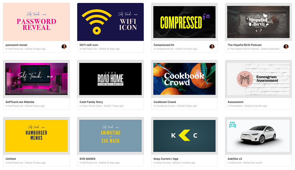
My first artboard is dedicated to “cover art.” I’ll label the first-page “COVER” and create a 1240 x 640 artboard. Even though this is first, it’s usually one of the last pieces I fill in. I don’t always know what image will be representative of my project.

Next, I’ll create a page with a bunch of dashes for the name. This page is empty but serves as a visual divider for the content.
Then, I add pages for all the design elements I need to create: website, email templates, branding elements, pieces for social media. For each type of content, I create a new page.
As I create the page, I may add artboard placeholders with notes for the elements I need to make. For example, I’ll list all the form fields the contact page needs or all the assets I want to include in the Press Kit.

Then, I’ll create a “Style Guide” page to hold my color palette, text styles, and components. I stub out this page with different artboards, creating placeholders for the different types of content I need: logos, typography, colors, form elements, buttons, components, and layouts.

I create a page for all my icons. Figma groups components in the library first by page, then by artboard. With that in mind, I like to keep this separate from the style guide.

Inside, I create an artboard for every letter of the alphabet:

Lastly, I create an artboard for archives. Once I’ve settled on a direction, I’ll clean-up my project by putting un-used pieces on the “Archive” page. I want to keep these elements because I may want to reference an idea or a concept.
With Figma ready to go, I start dropping in elements. If it’s an existing brand, I’ll grab all the current assets and put them inside Figma.
If it’s a brand new project, I’ll surround myself with inspiration: color palettes, typography, photography, and layouts.
Let’s walk through what this looks like on an actual project:
Recently, I started working on the branding for a new podcast I’m co-hosting with James Q. Quick. To start, all I had was a name: Compressed.fm.
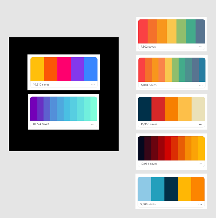
My first stop was Coolors. (Not a typo, and, yes, I like to emphasize the extra “o” when I say the name out loud.) There’s a great collection of existing color combinations users have submitted, as well as a fantastic color generator. I went through some of the trending palettes and took screenshots of options with potential. I dropped these in Figma.
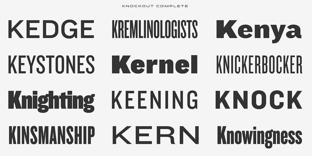
Then, I move to typography. I’ll go through My Fonts or Creative Market or Adobe Fonts and experiment with different words or phrases to see how they look, again taking screenshots of various options.
For Compressed.fm, I knew I wanted “Compressed” to be in a condensed font as if it’s “compressed.” Hoefler & Co has one of my all-time favorite condensed fonts: Knockout. When I started the project, I knew that’s what I wanted to use. It’s not always that obvious.
As I was looking for visual inspiration, I stumbled across the typeface: Greycliff. Its marketing site is beautiful, showcasing all its different weights. Again, I took a screenshot and dropped it into Figma.

I downloaded the font's trial version and started to play with various combinations of “Compressed” and “FM” in Knockout and Greycliff.


Nothing is dialed-in yet, but I keep taking screenshots and dropping them into Figma. I’m building a mood board alongside my work. These come from various sources: sites or web apps I like, illustrations, merch, competitors. I also make notes on how they handle specific problems. What’s the user experience like? What feeling does their brand evoke? How is their site structured? What’s their information architecture? Who’s their target audience? Is it the same as mine? What tone do they use in their copywriting?
Some of my favorite places to look for visual inspiration are Google Images, Dribbble, Behance, Sites Inspire, Instagram, The Best Designs. I use the Panda Chrome extension that aggregates several reputable sources. But, the best pieces always come from my Notion collection.
I’m always collecting.
I don’t wait until I sit down to work on a project to collect imagery. While I’m clicking around the web, I’m always taking screenshots. If I’m on my phone leisurely scrolling through Instagram and see something, I’ll take a screenshot on my phone. If I’m at a store and see a package design, window display, or shirt design, I’ll take a picture. These are all filed and tagged, making them easy to find in the future.

When I start on a project, I sift through my collection, adding even more elements to my Figma page.


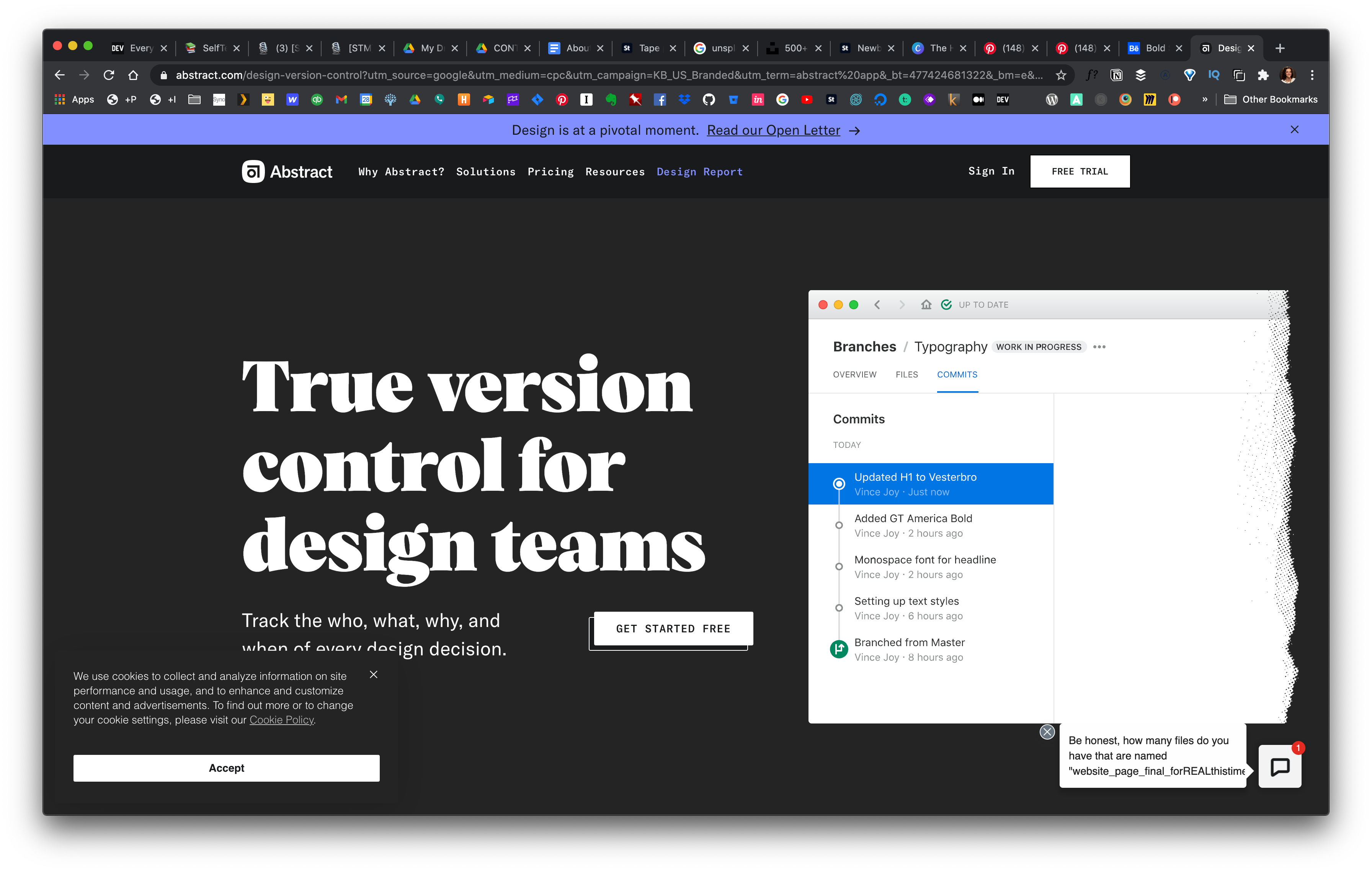
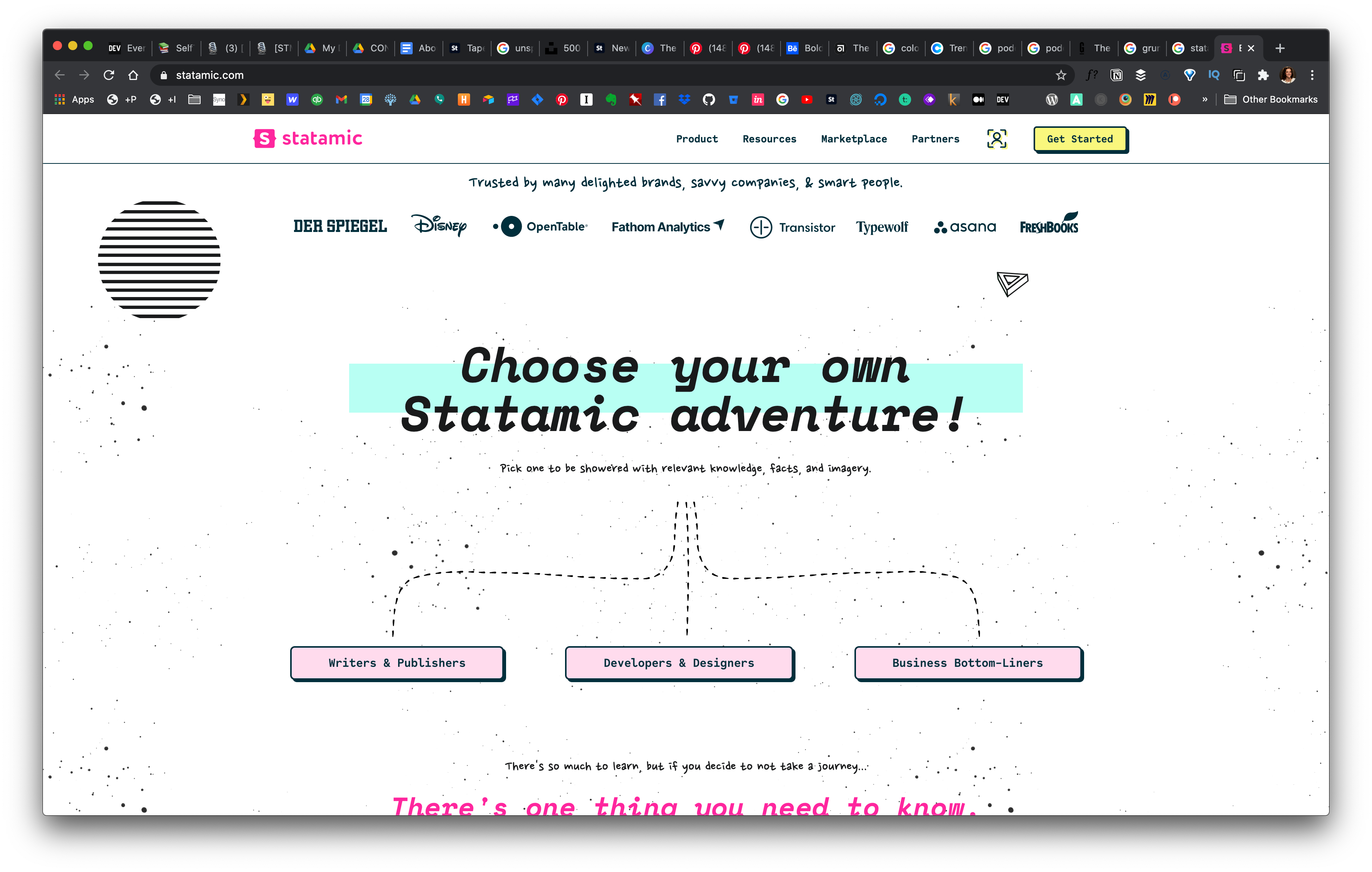


Once I feel comfortable with the visual research I’ve collected, I’ll add all the elements that need to be included on the page. For a website, this might consist of text for the navigation, embed players, headlines, social media icons, a copyright statement for the footer, etc. They’re not styled. They’re not sized correctly. It looks far from perfect. But, it lets me see what I have to work with. Similar to a puzzle, I see all the pieces I need to use. I can start fitting them together and visually making connections.


Creativity is just connecting things. When you ask creative people how they did something, they feel a little guilty because they didn’t really do it, they just saw something. It seems obvious to them after a while, that’s because they were able to connect experiences they’ve had and synthesize new things. ~Steve Jobs
Slowly, ideas begin to take shape. I keep playing and experimenting. Again, I don’t get rid of old elements. I duplicate and iterate. Even if I want to “throw away” an idea, I won’t get rid of it entirely. I move it to the archive page.
In this stage, I create without judgment. Sometimes, I’ll even design something that I know will be bad to get it out of my head. There’s something about getting it on the canvas that relieves mental space and gives me the freedom to continue moving forward: on to the next idea.
With Compressed, I started with the podcast cover because it would influence the site’s design.
It doesn’t always work that way. Sometimes the most important thing is to keep moving forward, even if that means starting with the footer or nailing a form design. Once you start, it’s easier to get into a flow state. Don’t let the starting hold you back. Go for small wins.
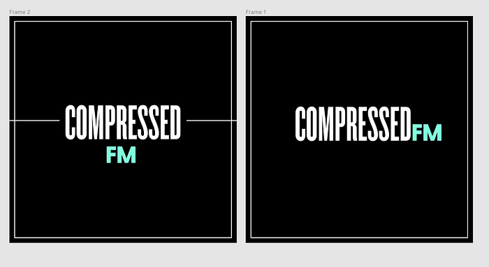

Here, I started to make a transition. I finally had a direction and had dialed in the podcast artwork. But, I’m still playing with different color palettes. Ultimately, I decided to use solid colors because they felt more gender-neutral.

Once I finished designing the homepage, I cleaned up my project within Figma. I moved the art elements that were no longer in line with the design to the archive page.


Granted, this process may not work for everyone. But, it removes the fear of the blank canvas. It helps me find forward motion on projects even when I feel like I have nowhere to go.
